Tools: Illustrator, Atom (Text-Editor)
Course: Programmed designing 2
Goals: Visualising a data set with Javascript. The information should be presented without using any pictograms and / or alphanumeric characters and made tangible to the viewer through interaction.
The interactive datagrafis is not available for mobile phones.
In science, data visualisation is a common research method. The classical periodic table contains an incredible amount of information which are not comprehensible to the eye. With the help of visualisations and interactions, connections can be experienced.
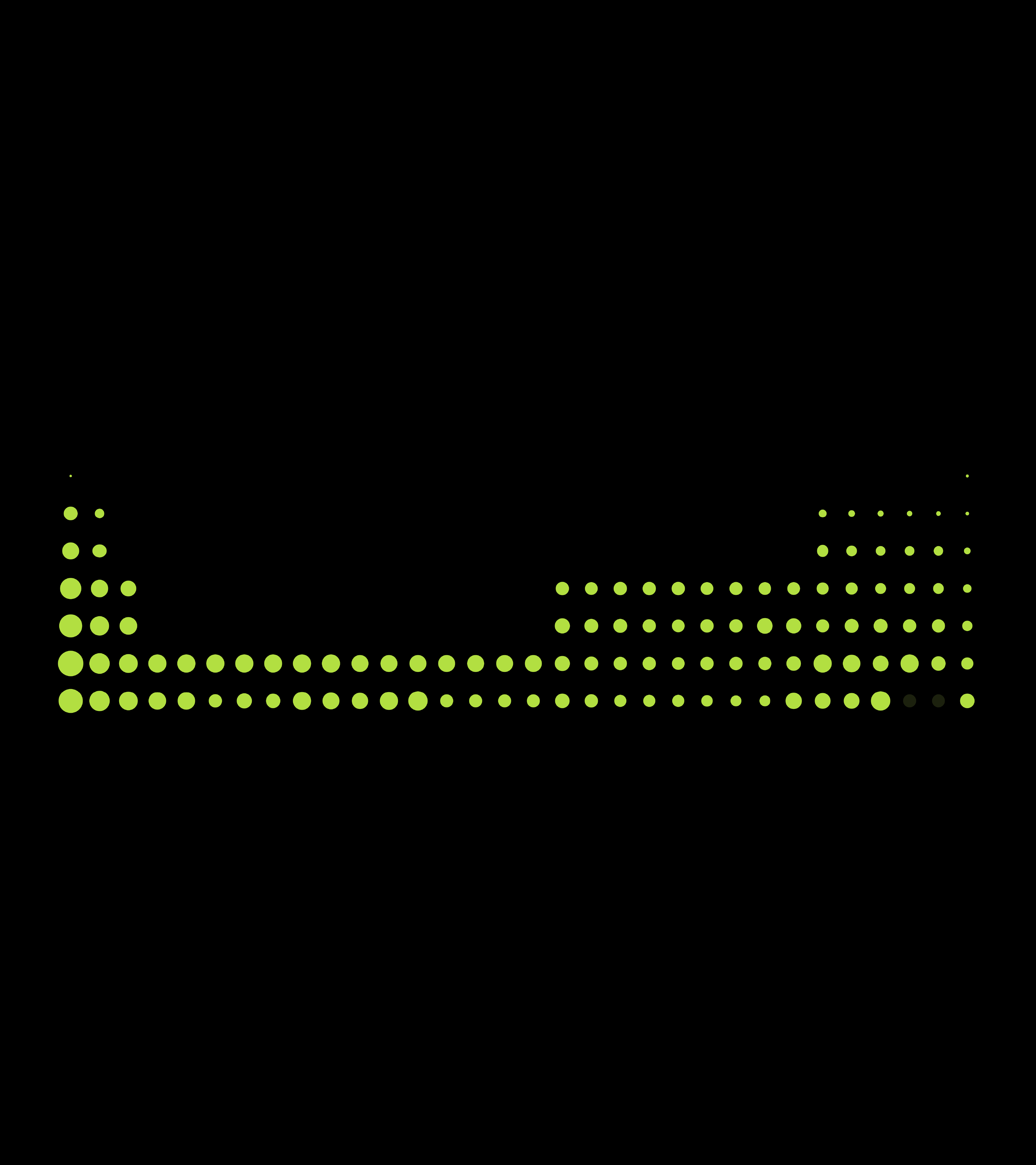
The data set originates from various sources, including the names of all known atoms and a selection of their key properties, such as electronegativity or their deposits on earth.

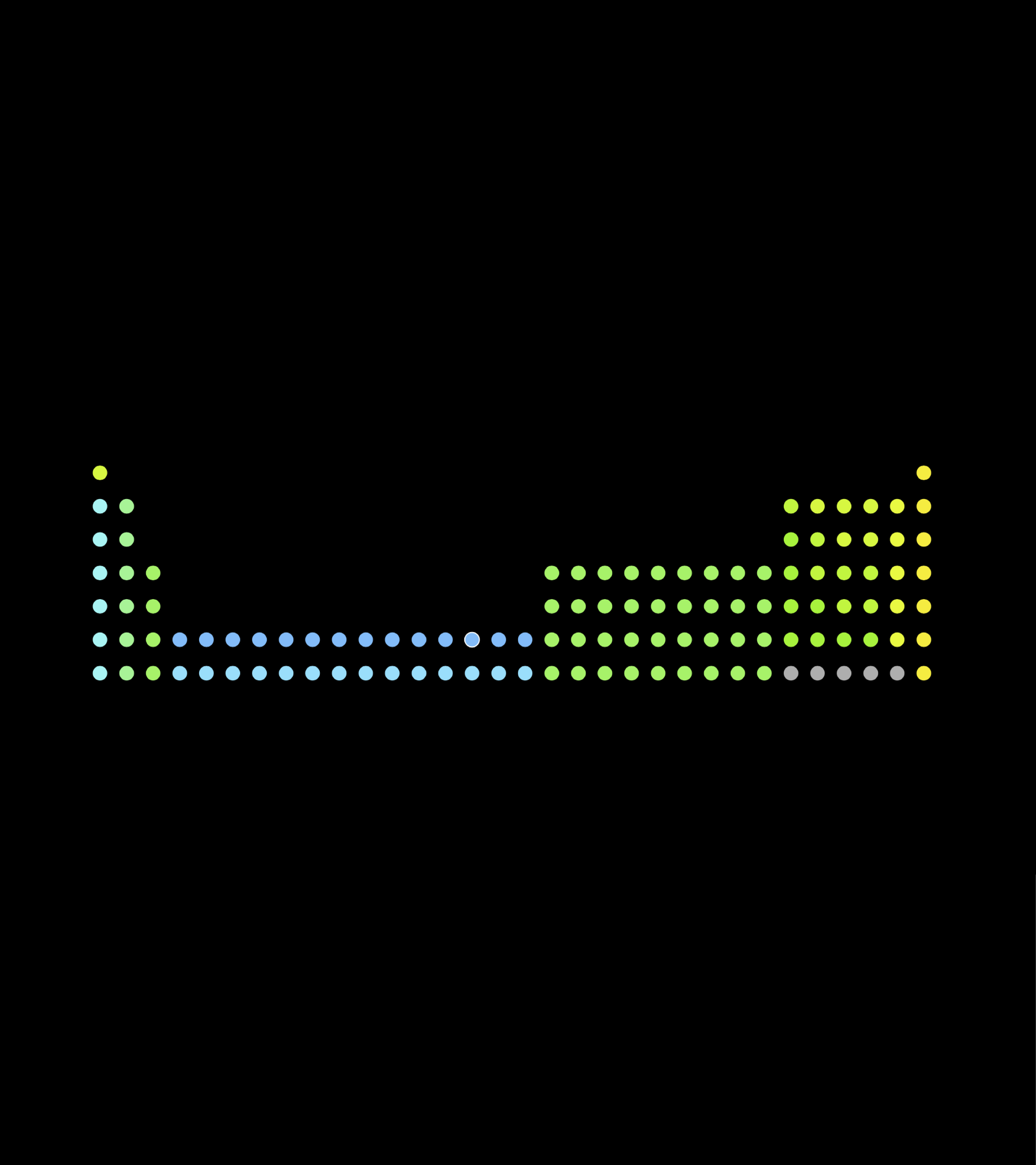
The initial point of the animation is the discovery years of the element. In the course of time, the number of circles on the screen increases, eventually forming the periodic table as it is known today.
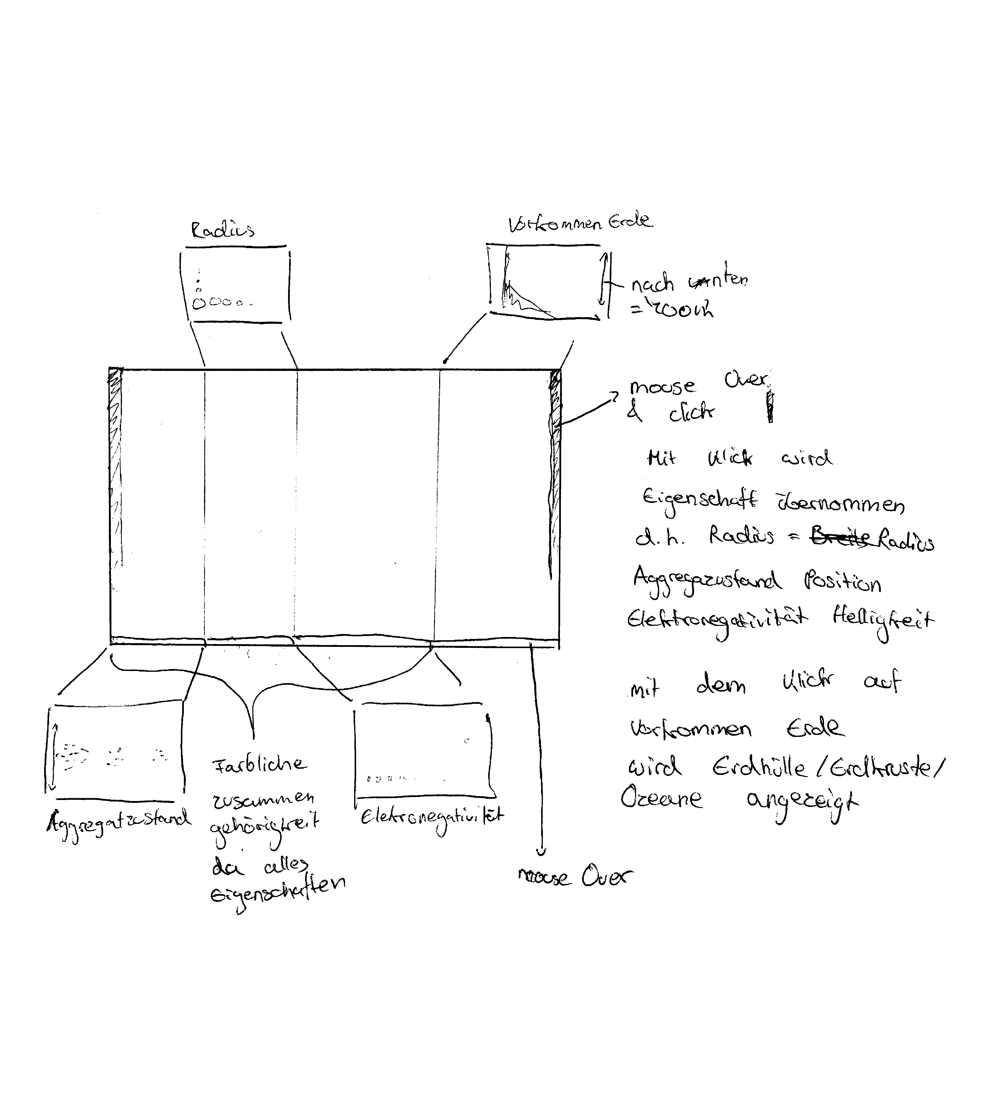
The atomic radius is represented by the radius of the individual elements, the arrangement being based on the periodic table of Fischer and Kohler. Moving from the left to the right as well as from top to bottom, the elements are put into an order according to their atomic radius, starting with the biggest elements on the left-hand side, ending with the smallest ones on the right-hand side.
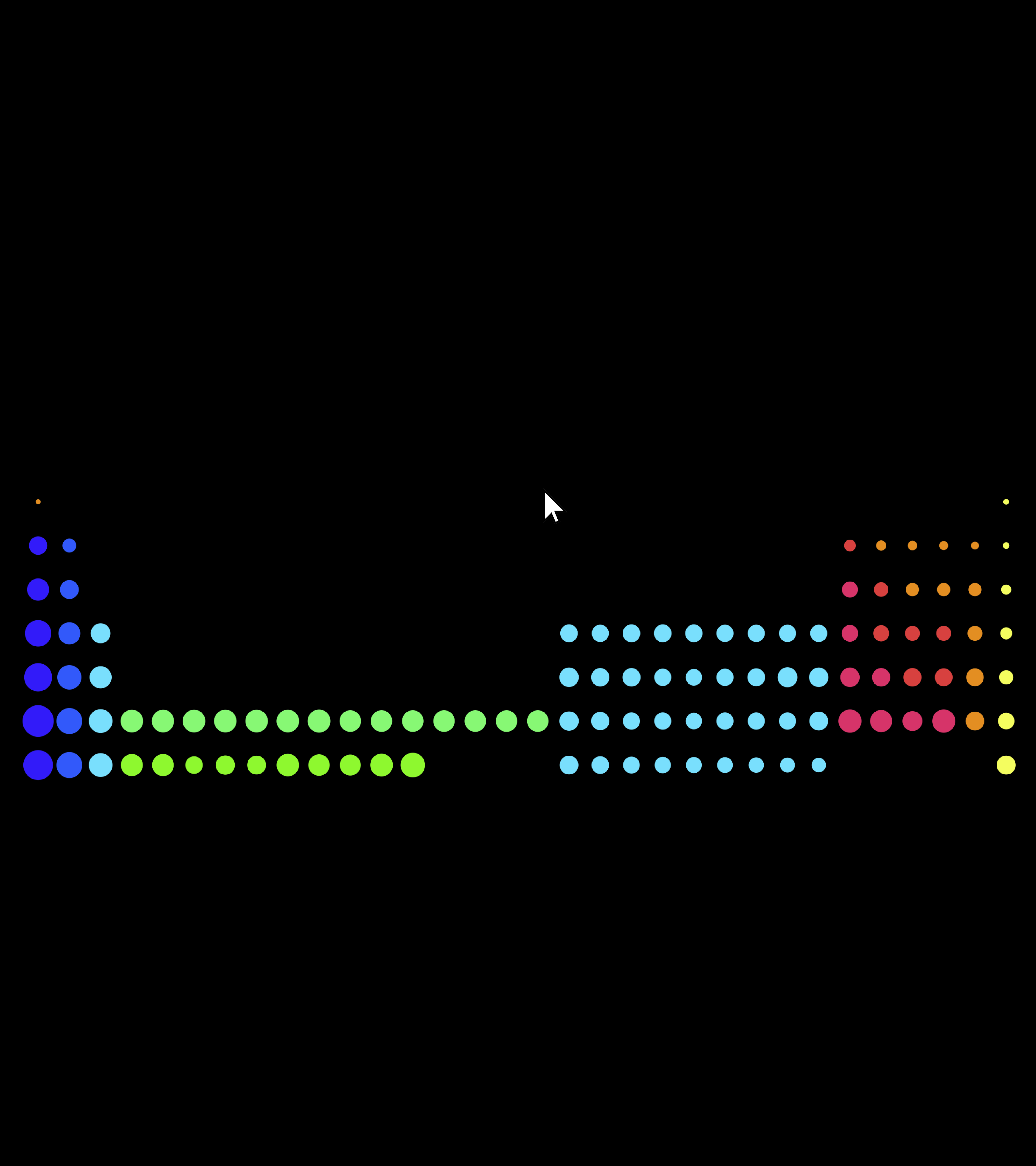
In order to achieve a higher recognition and to point out connections - such as the state of aggregation or the differenz groups of elements - the colouring of the atoms depends on the element group they belong to.
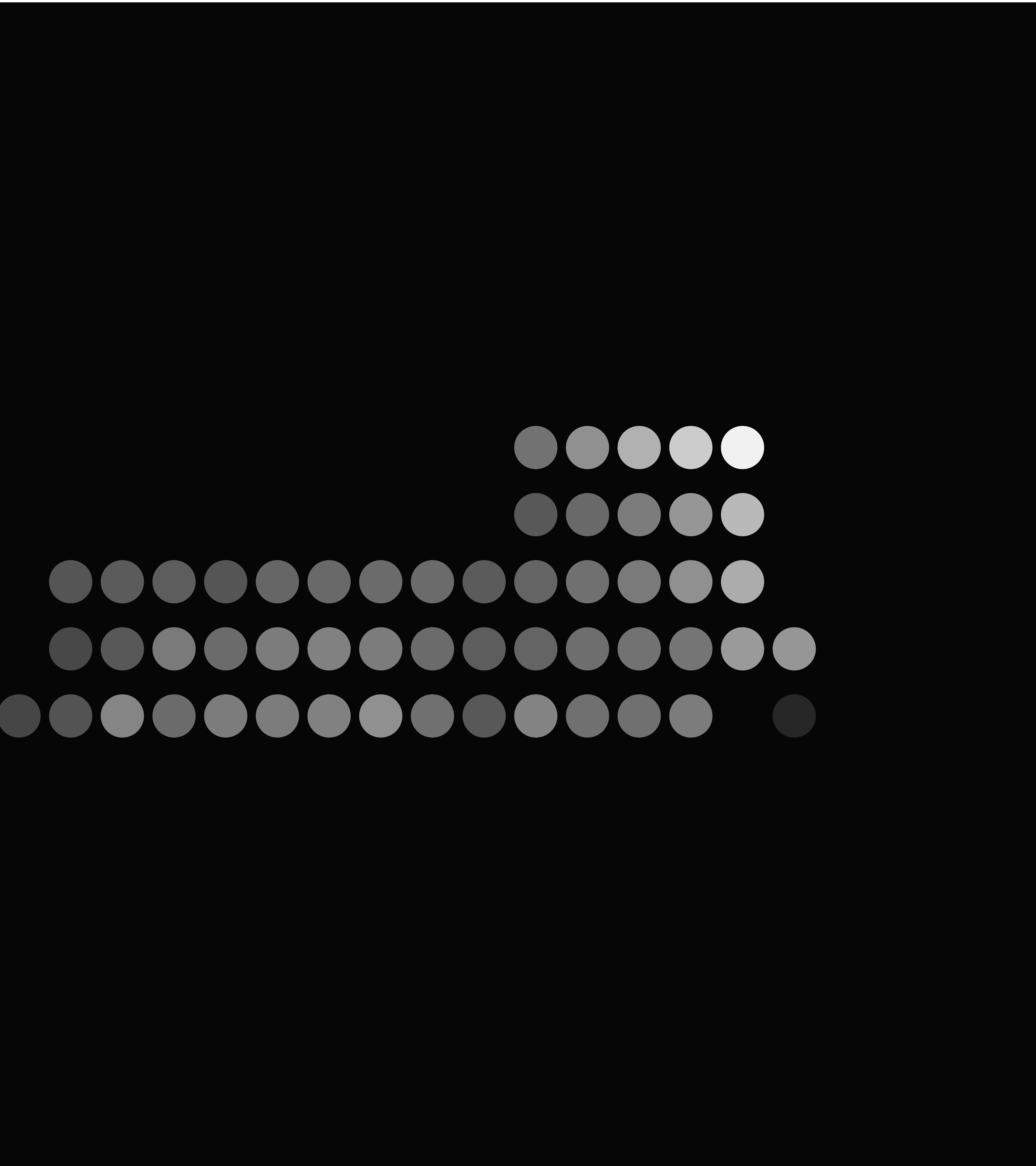
Electronegativity (= the measure of the ability to attract electrons in a chemical binding) is visualised by the level of opacity. The higher the potential, the brighter the atoms radiates.
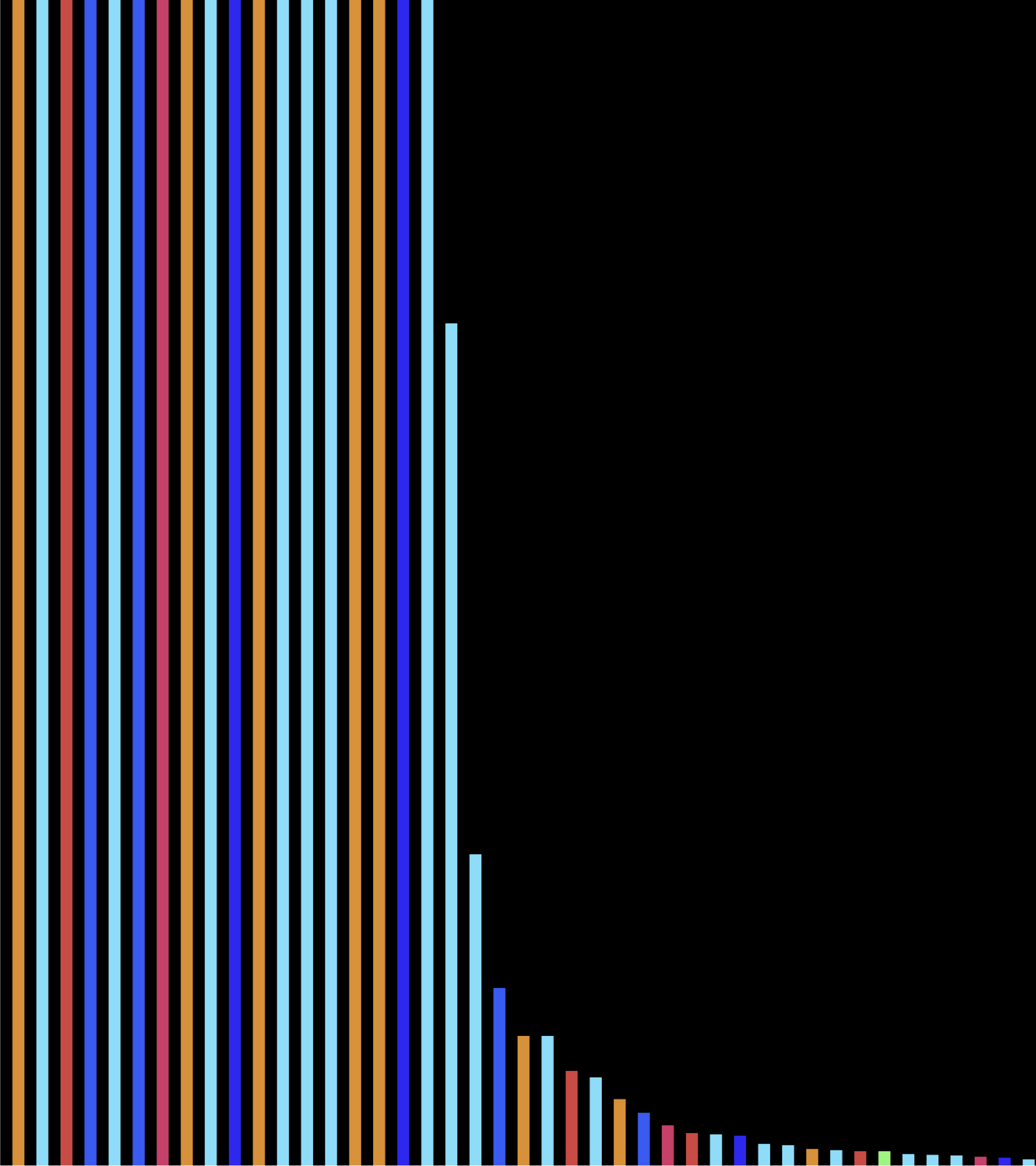
The occurrence of elements on earth is shown in a bar chart. It is possible to change the scale of the chart by using the mouse cursor.
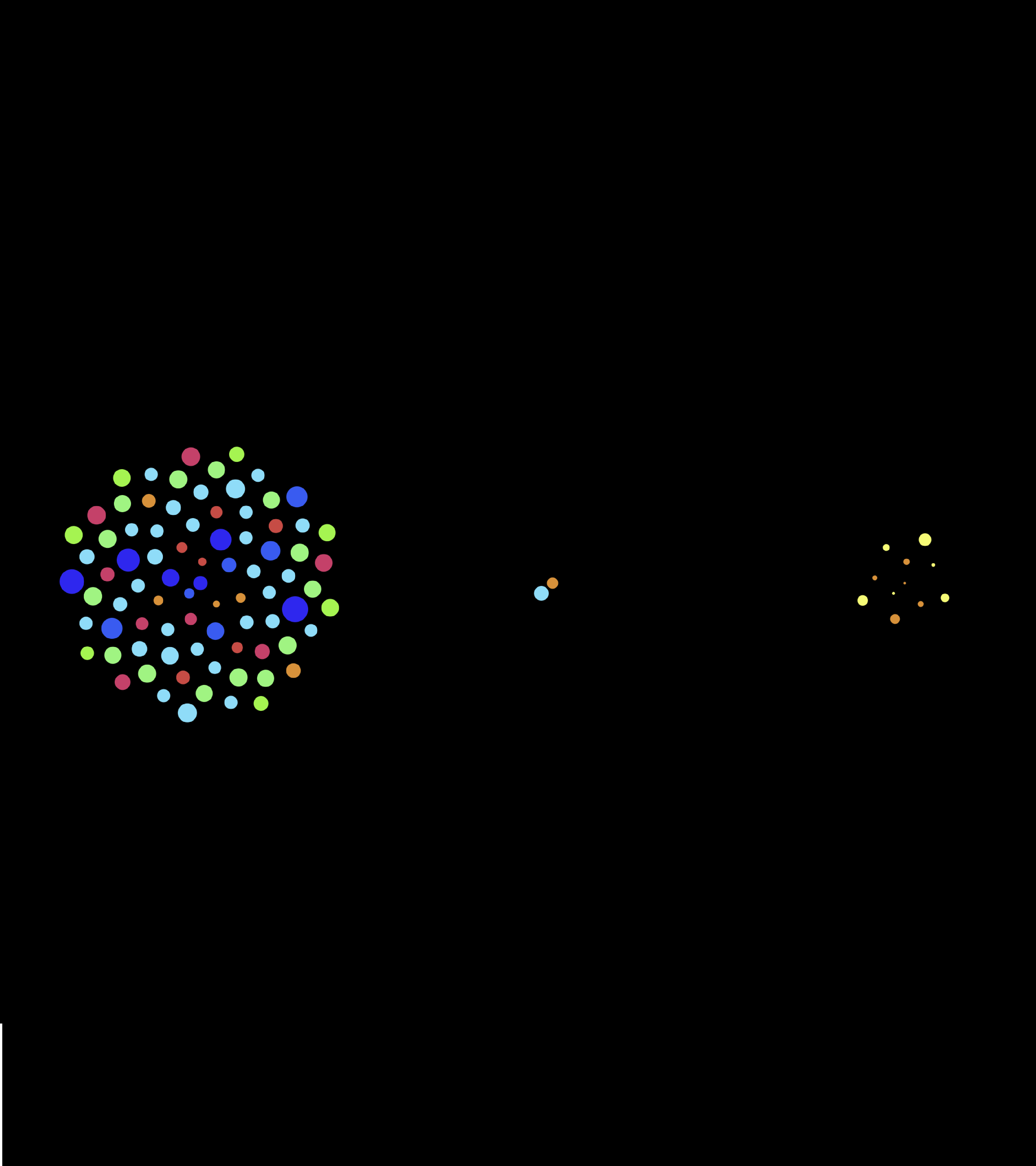
Depending on their natural state of matter (solid, liquid, gaseous), the elements are sorted into one of the three groups displayed. However, using the mouse cursor, the users can vary the temperature, thereby influencing the state of aggregation of the elements and initiating necessary rearrangements of the elements, as the state of matter depends on a specific temperature.
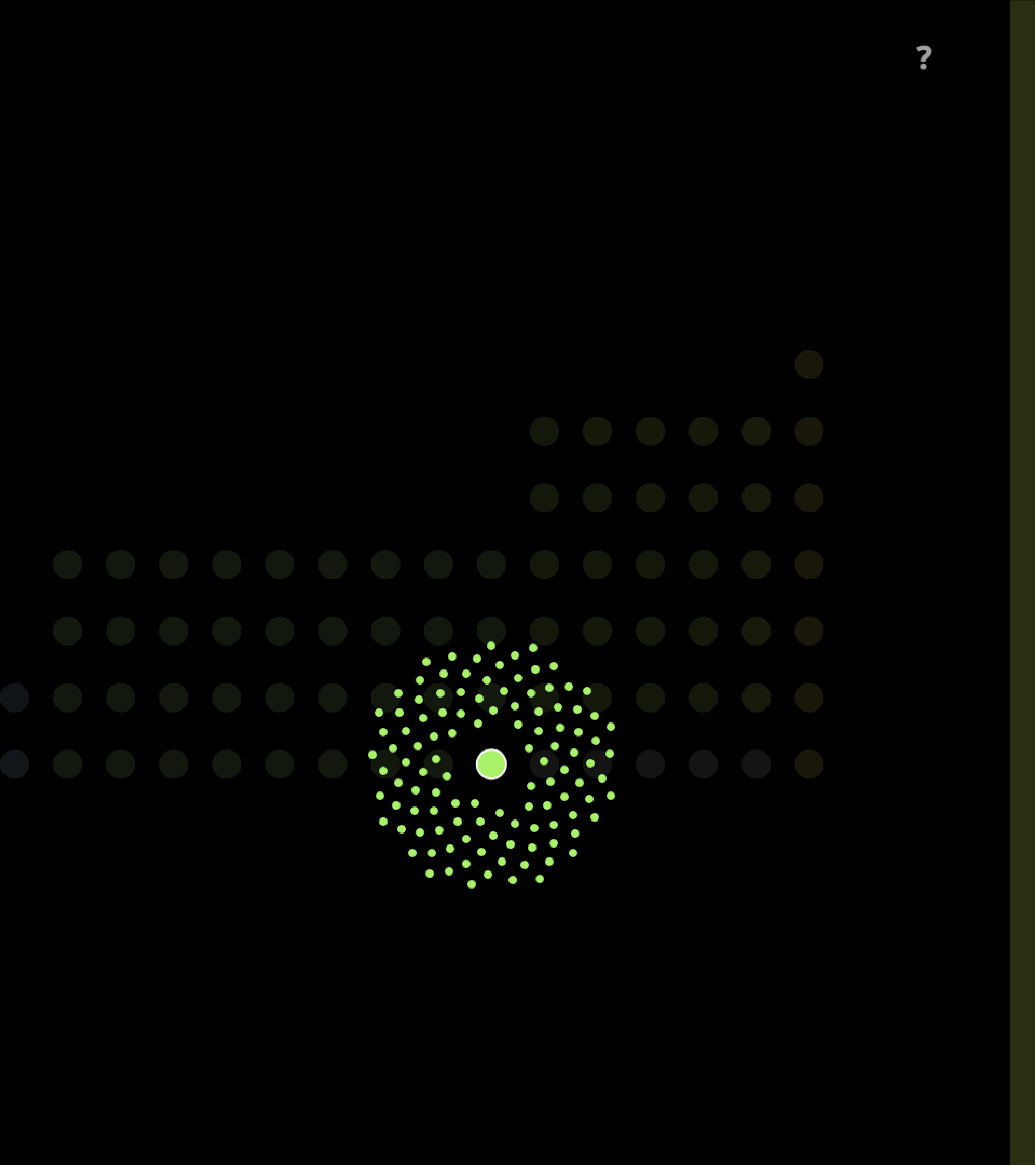
The electrons are represented by the amount of circles surrounding the atoms.
After defining the visualization of various properties, it was necessary to develop a logic system. Initially, the users are visually encouraged to start the start animation, eventually being led to the main page. Depending on the x-position of the mouse, different properties can be seen. With a click on one of the elements the electrons become visible. On the side the users can find a button, leading to the display of ever the state of aggregation or the occurrence on earth.
Through visualizing this data graphic I learned a lot about displaying data sets. I find it fascinating to visualize abstract numbers in various ways, creating multiple interaction possibilities for the users. Furthermore, my programming skills were enhanced.