Tools: Miro, Figma, Premiere, After Effects
Team: Alicia Hardegen, Bianca Tillmann, Sarah Kuklinski
Course: Application Design 1
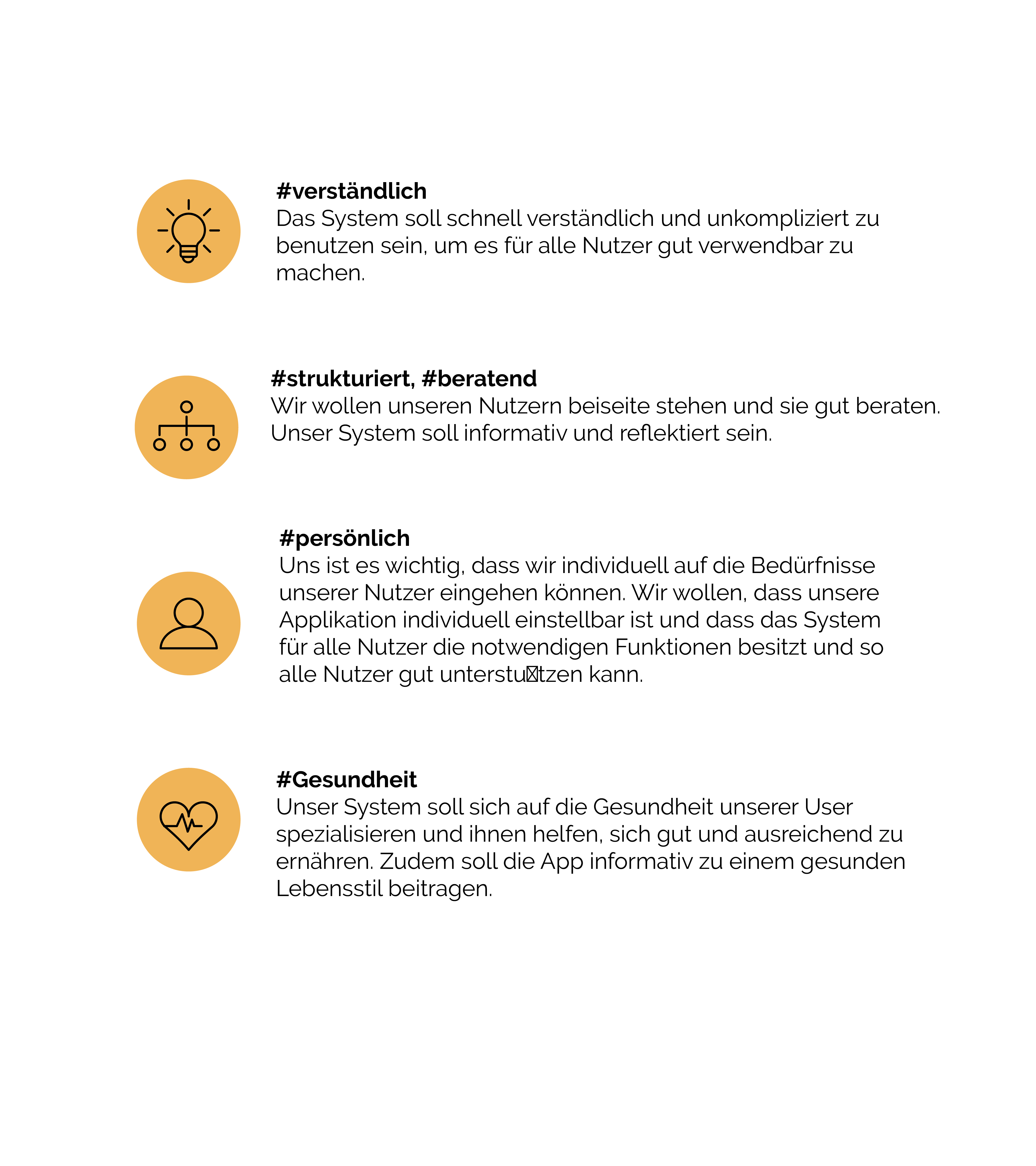
Goals: Transforming a poorly designed app into a user-oriented and better designed one.
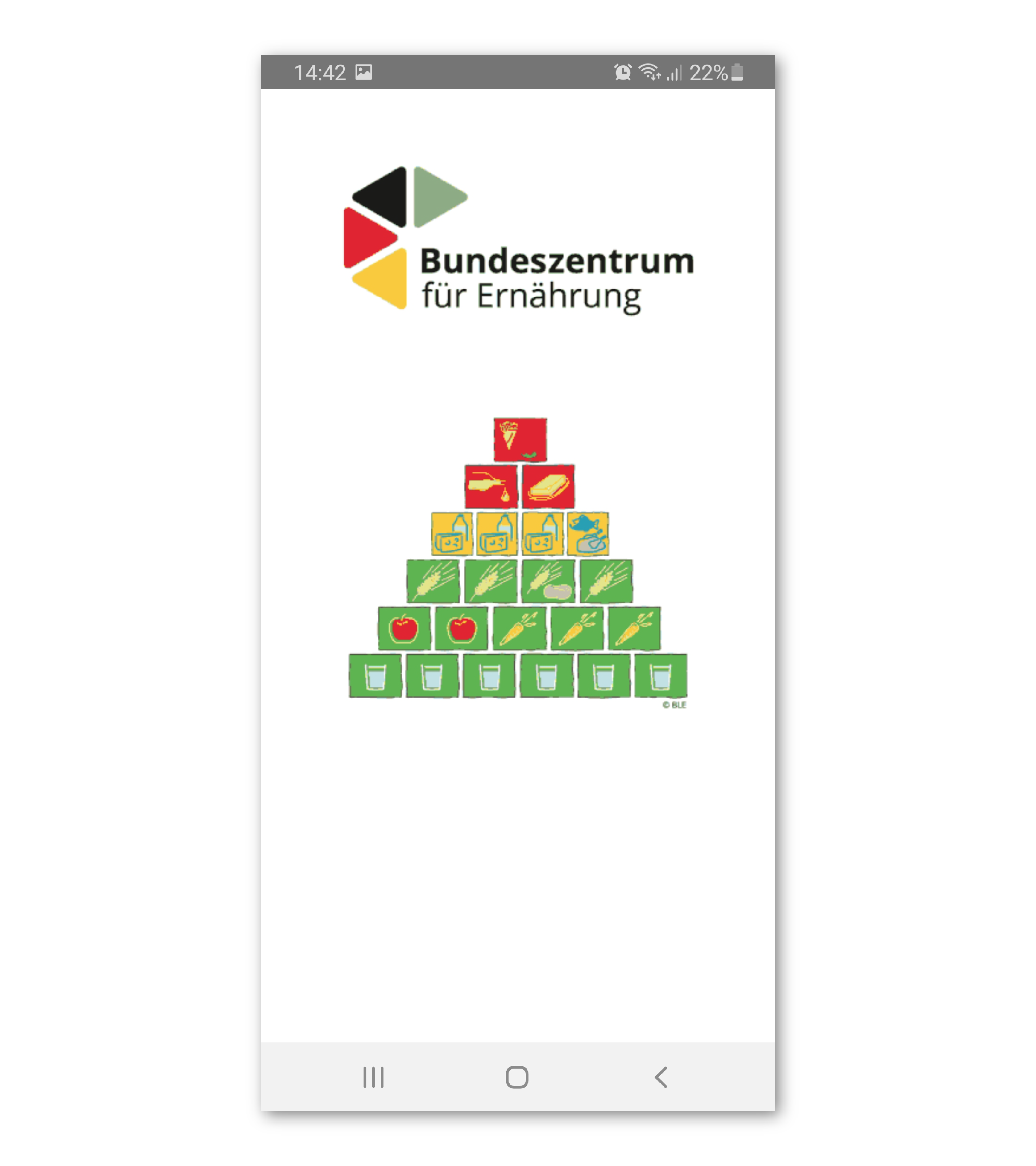
„was ich esse“ covers the topic of healthy nutrition. The scientific basis of the app is the well-known model of the food pyramid. The app is supposed to stimulate the users to adopt a healthy and balanced diet. The app´s social impact is to influence individuals to change their eating habits, decreasing nutrition problems, such as malnutrition and undernourishment. A widespread change of habits and a conversion of as many individuals as possible could not only enhance public health positively, but also reduce the public costs of unhealthy nutrition.
With the help of various methods (persona, user journey, card sorting, SWOT analysis, screenflow, function analysis, in-depth interview) the current app was analyzed, specifications defined and first ideas created.
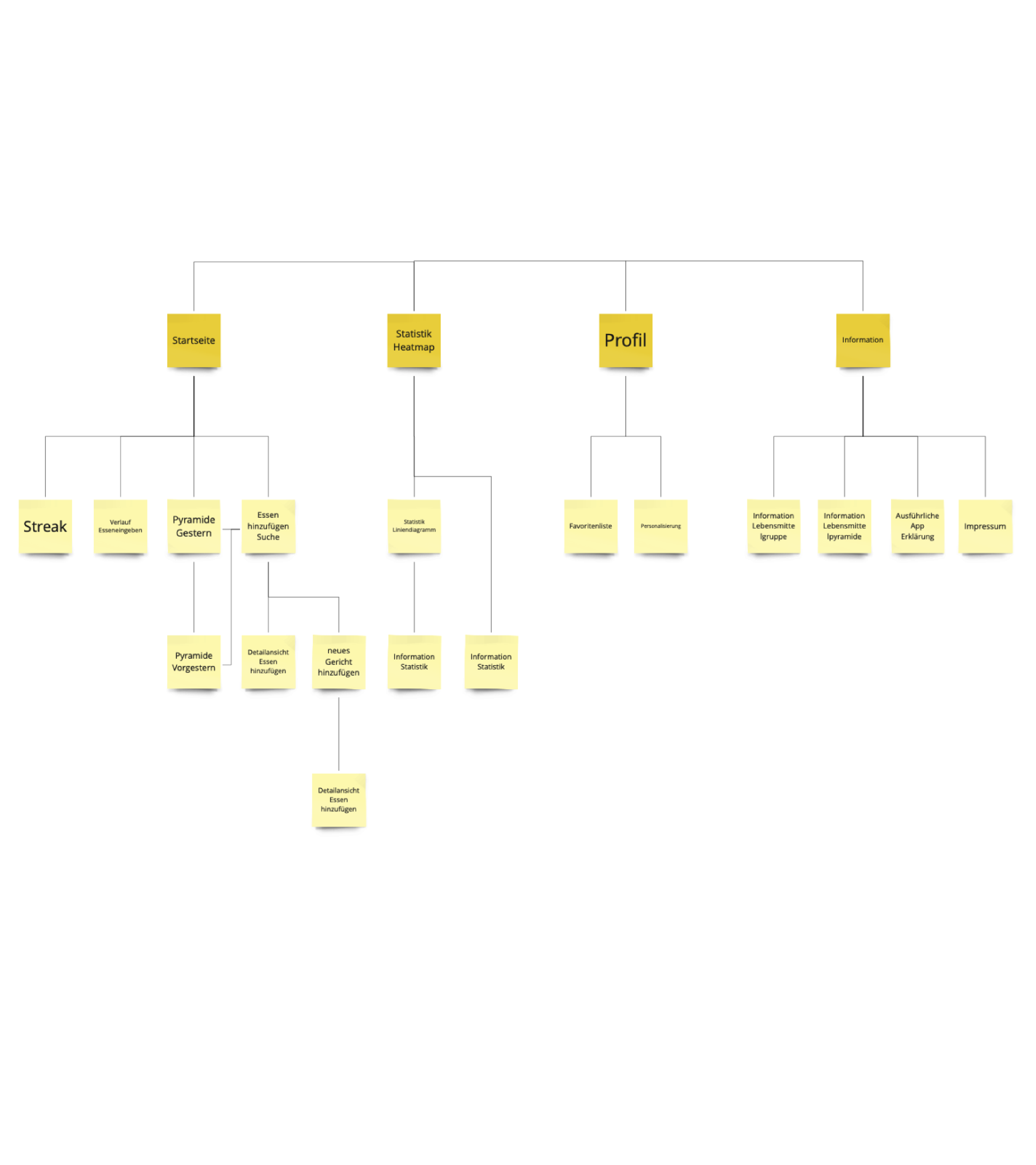
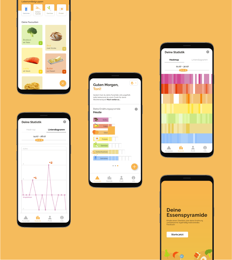
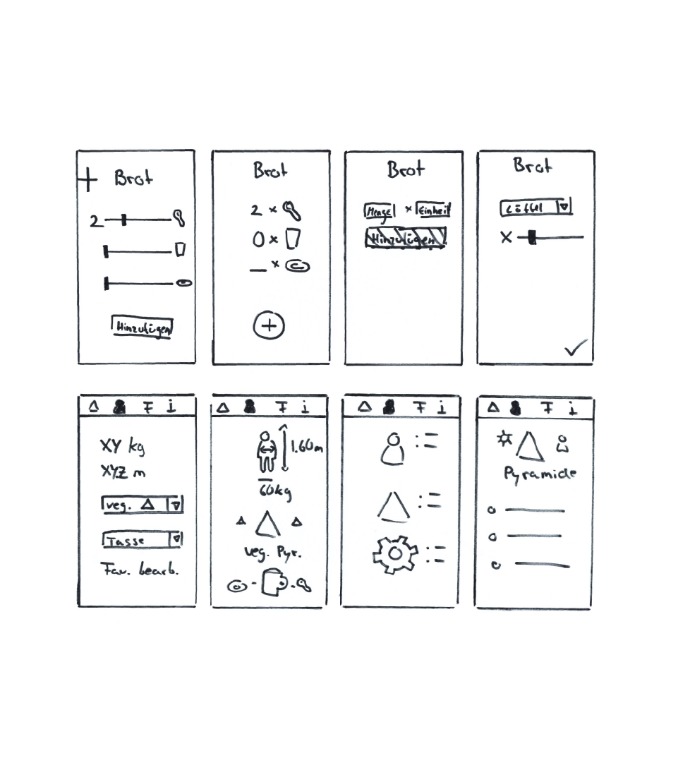
Based on the results of the analysis, a new information architecture was developed. The app should provide a simple structure, following the principles of the food pyramid, which was originally developed to provide a quick reference guide to remind individuals of the basics of good nutrition and healthy eating. The food pyramid being used as home screen from where the users might navigate further into the app. The information architecture is simplified and structured more clearly.
The process of wireframing (basic layout of the screens) was accompanied by many versions and discussions ofthe development team, the final result combining the best solutions of the test versions.
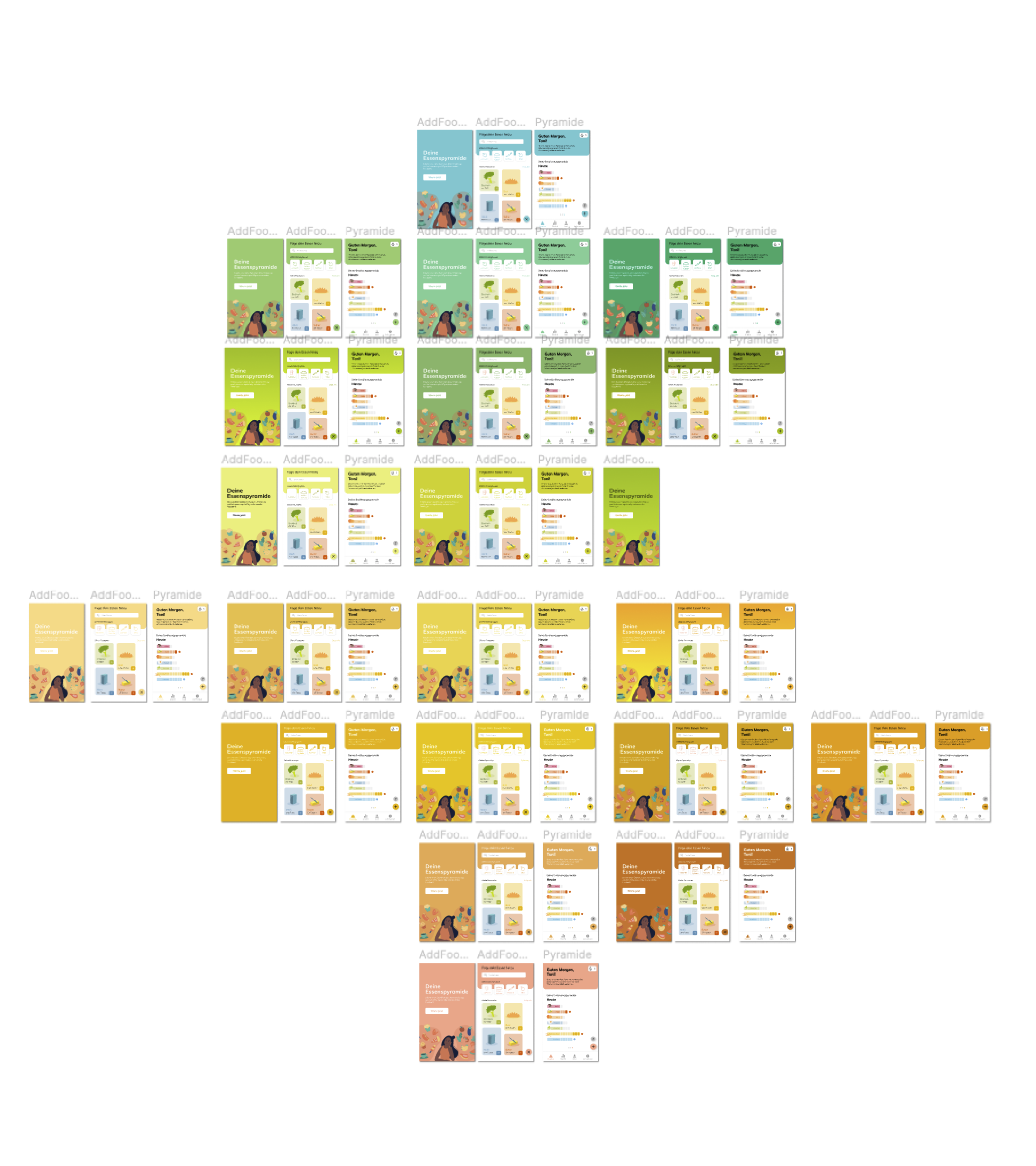
As far as typography and UI elements are concerned, the team members selected different styles, which vary according to the function. A design sprint resulted in the choice of colours, creating a
coherent and conclusive solution for the entire team. Characteristics and themes were assigned to matching colours:
- Friendly = light and warm colours, yellow and orange
- Motivating = orange and yellow
- Playful = Yellow, Orange, Pink
- Food = rainbow colours, colourful
- Health = white, green and blue
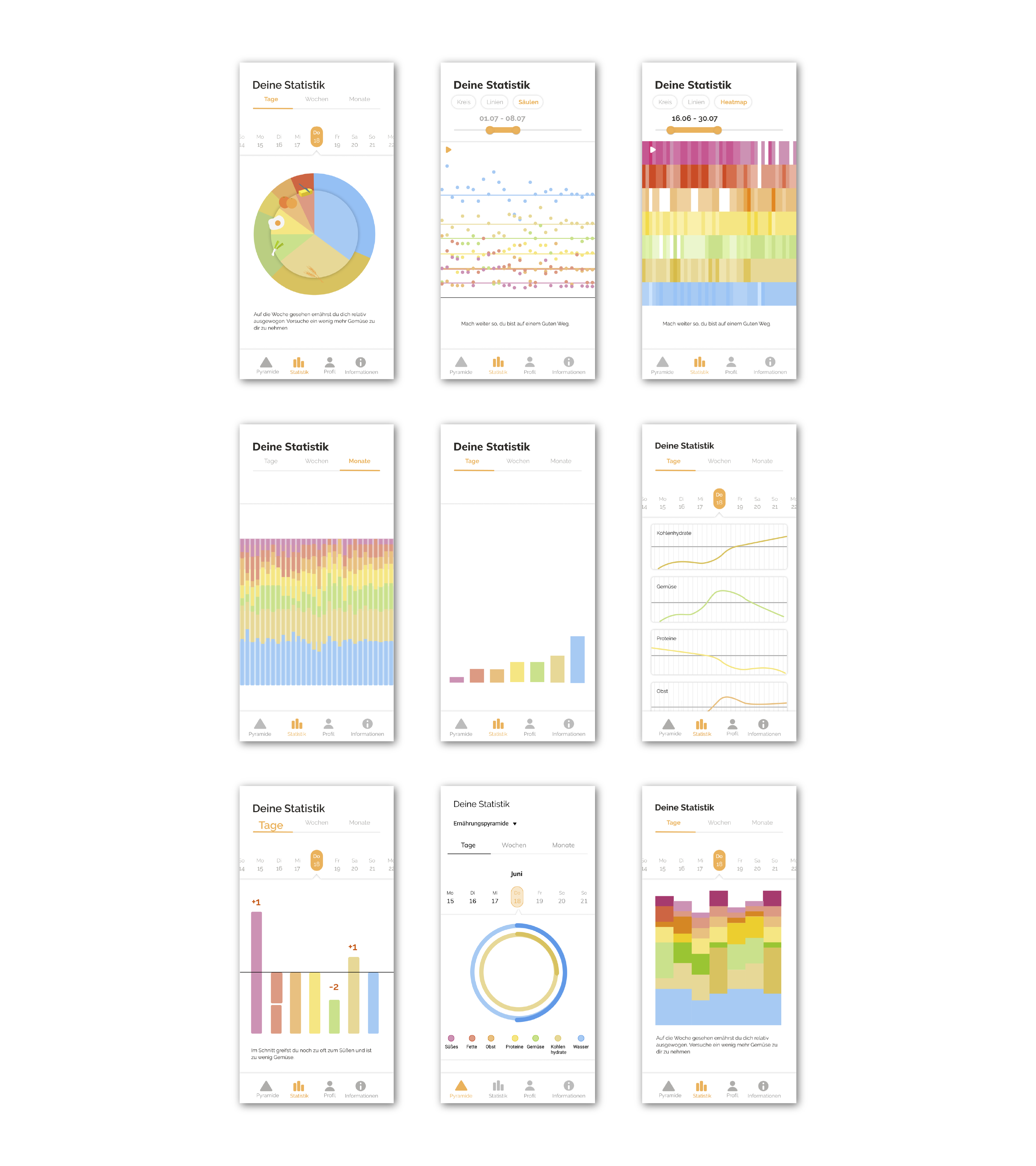
In the existing app the potential of the statistical information has not been used, which is why the optimization was very important to us. Different presentations were tried and tested. Depending on the visualization, different content was focused.
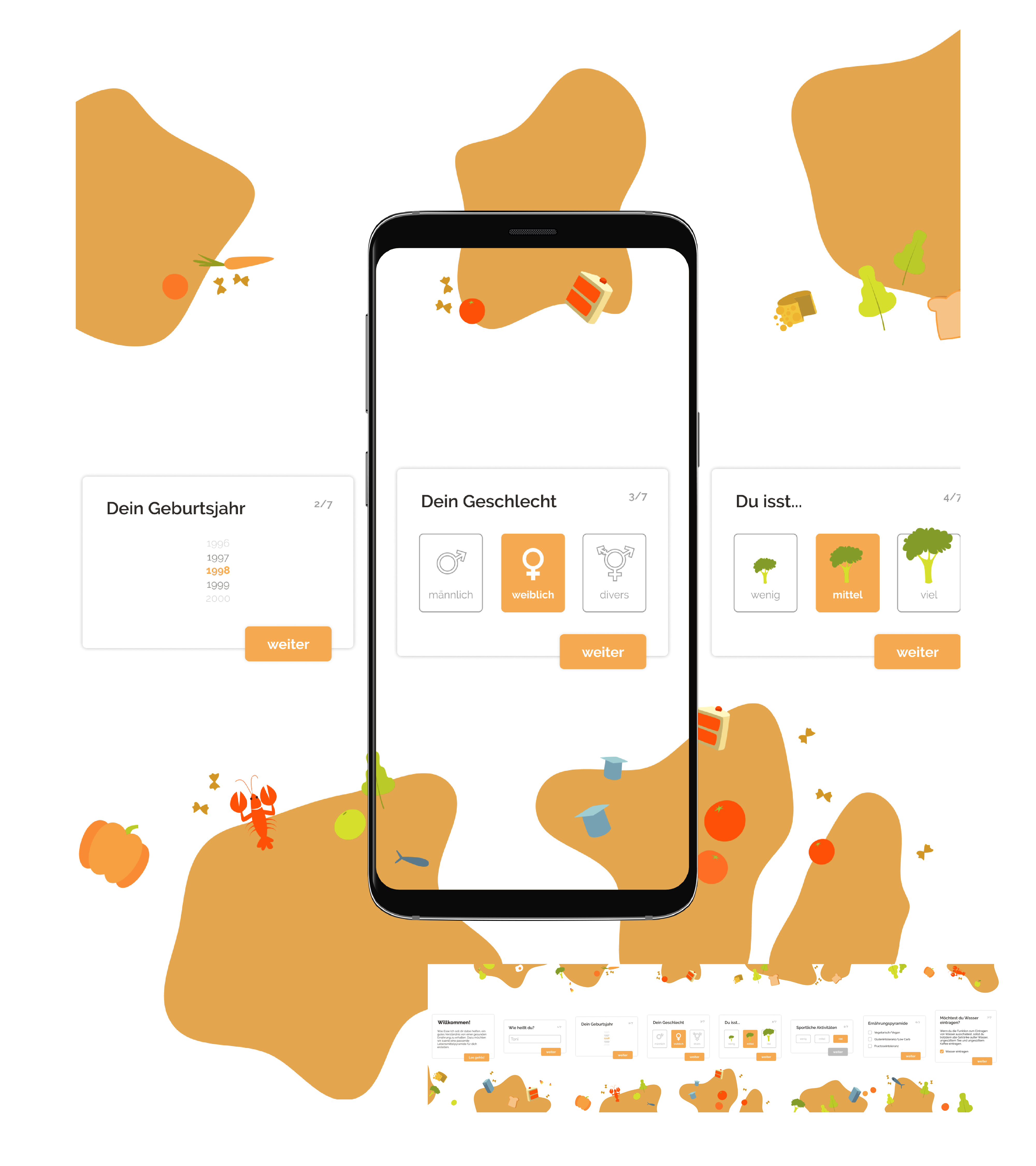
To provide the user with the possibility to configure the app according to his / her individual features, the creation team added an onboarding feature to the system. Therefore, the team performed a research of the food pyramid and its history, finding out more about the different food groups and how many grains, meats, fruits, veggies, and dairy products a healthy human being needs each day
The design contains to Illustrationen from Freepik.
In the process of this redesign I got to know many different methods that helped to highlight different issues, creating new ideas. Another learning from this project was the organization of a redesign or projects of similar standards. The process enhanced the creating team´s communication and cooperation, emphasizing how the project could profit best from the different talents of each team member, despite oft he challenge of a pandemic-caused remote term.